
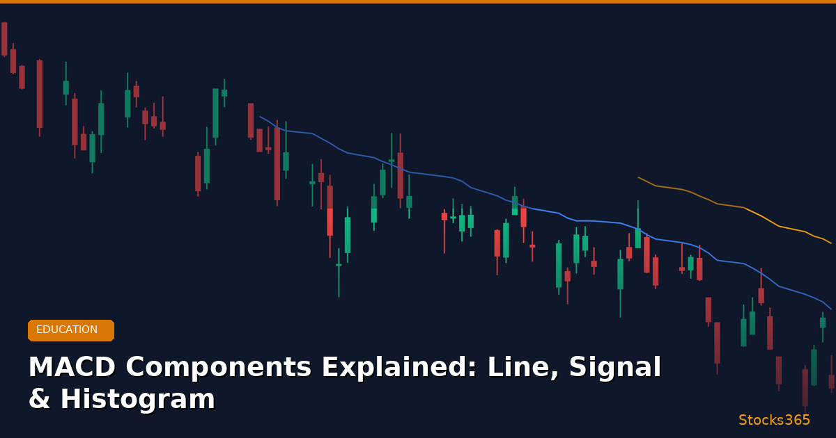
MACD Components Explained: Understanding the Full Picture
The Moving Average Convergence Divergence (MACD) is one of the most widely used technical indicators in modern trading — and for good reason. It combines momentum, trend direction, and signal generation into a single, readable display. Yet many traders use it without fully understanding what each component actually measures.
In this guide, we break down every MACD component explained in plain terms: what the MACD line represents, how the signal line is derived, and what the histogram is really telling you about momentum shifts. Whether you're trading equities, crypto, or ETFs on platforms like Stocks365's signals dashboard, understanding these three elements will sharpen your entries and exits significantly.
Key Insight: MACD is not just a trend-following indicator — it's a momentum oscillator that captures the relationship between two moving averages, giving traders early warnings of trend changes before price confirms them.
What Is MACD? A Quick Foundation
Before diving into each component, it helps to understand what MACD is measuring at its core. Developed by Gerald Appel in the late 1970s, MACD tracks the convergence and divergence of two exponential moving averages (EMAs). When these moving averages come together (converge), momentum is slowing. When they move apart (diverge), momentum is building.
The standard MACD settings use three numbers: 12, 26, and 9. These represent:
- The fast EMA period (12 periods)
- The slow EMA period (26 periods)
- The signal line period (9 periods)
These defaults work well across most timeframes and instruments, though active traders often adjust them for specific strategies. Now let's examine each MACD component explained in detail.
MACD Component #1: The MACD Line
How the MACD Line Is Calculated
The MACD line is the foundation of the entire indicator. It's calculated by subtracting the 26-period EMA from the 12-period EMA:
MACD Line = 12-period EMA − 26-period EMA
Let's use a real-world example. Suppose NVDA is trading around $890. If the 12-period EMA is at $885 and the 26-period EMA is at $878, the MACD line value is +7.00. This positive reading tells you that the short-term average is above the long-term average — meaning upward momentum is currently dominant.
If NVDA's price starts declining and the 12-period EMA drops to $870 while the 26-period EMA stays at $878, the MACD line becomes −8.00, signaling that bearish momentum has taken control.
What the MACD Line Tells Traders
- Above zero: Bullish momentum — the short-term EMA is above the long-term EMA
- Below zero: Bearish momentum — the short-term EMA is below the long-term EMA
- Rising MACD line: Momentum is accelerating in the bullish direction
- Falling MACD line: Momentum is accelerating in the bearish direction
- Crossing the zero line: A potential trend change signal
The MACD line alone is useful, but it becomes far more powerful when combined with the signal line — which brings us to component number two.
MACD Component #2: The Signal Line
How the Signal Line Is Calculated
The signal line is a 9-period EMA of the MACD line itself. This smoothing function is what makes crossovers tradeable rather than just noisy fluctuations.
Signal Line = 9-period EMA of the MACD Line
Because the signal line is a smoothed version of the MACD line, it reacts more slowly to price changes. This lag is actually intentional — it creates a clear visual gap between the two lines, making crossovers easier to identify.
MACD Crossover Signals — The Core Trading Application
The interaction between the MACD line and the signal line generates the two most commonly traded signals in technical analysis:
Bullish Crossover (Golden Cross on MACD): When the MACD line crosses above the signal line, it suggests that momentum is shifting bullish. For example, if TSLA's MACD line was at −4.20 and crosses above the signal line at −4.80, traders interpret this as a potential buying opportunity — especially if it occurs below the zero line, indicating a recovery from oversold conditions.
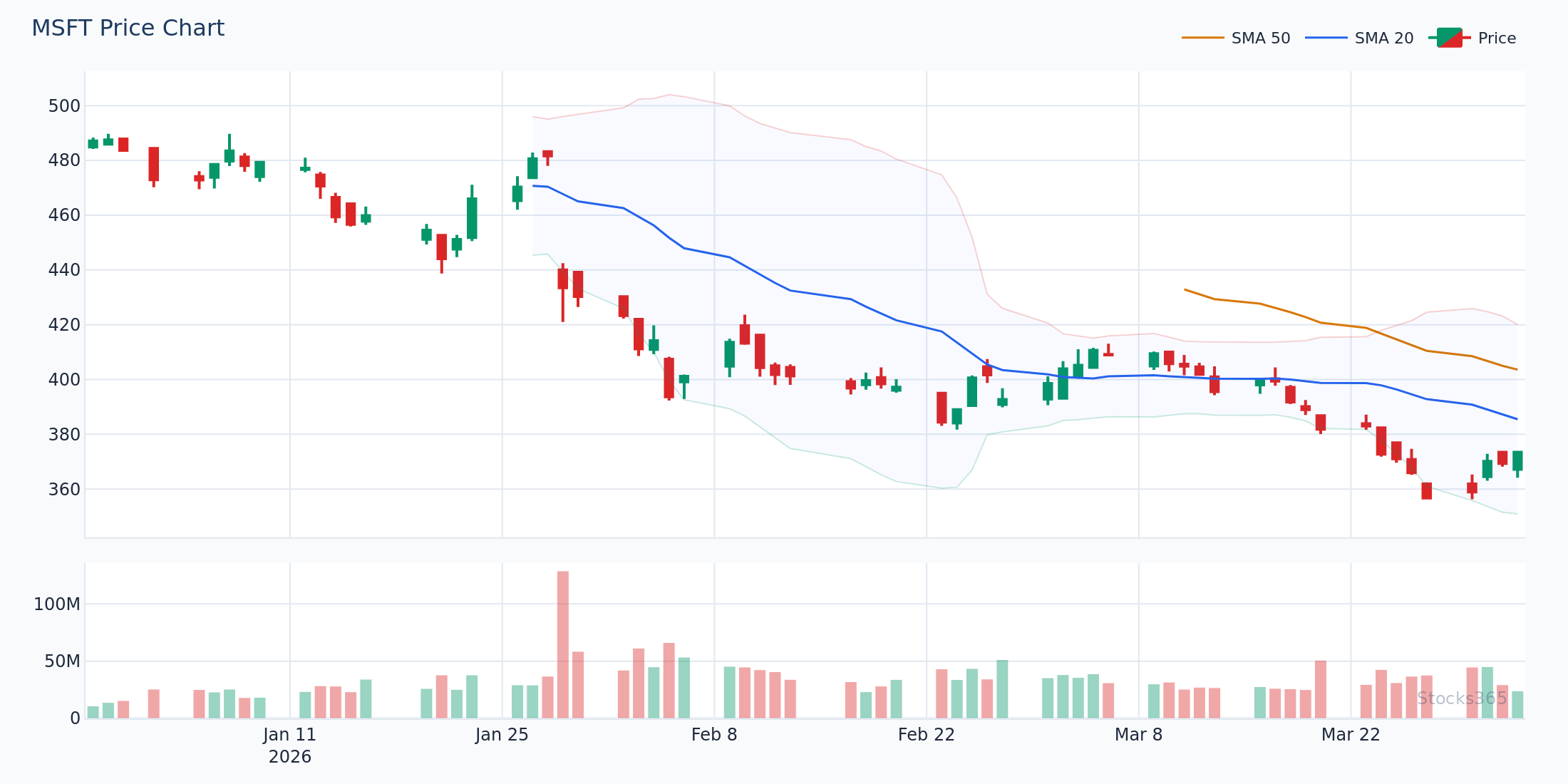
Bearish Crossover (Death Cross on MACD): When the MACD line crosses below the signal line, momentum is shifting bearish. If MSFT's MACD line was at +3.10 and falls through the signal line at +3.50, that crossover warns of weakening bullish momentum or a potential reversal.
The Importance of Crossover Location
Professional traders pay close attention to where a crossover occurs relative to the zero line:
- Bullish crossover above zero: Strong continuation signal in an uptrend
- Bullish crossover below zero: Early reversal signal — higher risk, higher reward
- Bearish crossover below zero: Strong continuation signal in a downtrend
- Bearish crossover above zero: Early warning of trend reversal from a peak
MACD Component #3: The Histogram
How the MACD Histogram Is Calculated
The MACD histogram is often the most underappreciated of the three MACD components explained here — yet it provides the earliest signals of momentum change. The histogram is calculated by subtracting the signal line from the MACD line:
Histogram = MACD Line − Signal Line
When the MACD line is above the signal line, the histogram prints positive bars (above the zero line). When the MACD line is below the signal line, it prints negative bars (below the zero line). The height of each bar represents the distance between the two lines.
Reading Histogram Bar Patterns
Here's where traders gain a true edge. Rather than waiting for a crossover to confirm a trade, the histogram lets you see momentum shifting before the crossover occurs:
- Growing positive bars: Bullish momentum is accelerating — the MACD line is moving away from the signal line
- Shrinking positive bars: Bullish momentum is fading — a bearish crossover may be approaching
- Growing negative bars: Bearish momentum is accelerating
- Shrinking negative bars: Bearish momentum is fading — a bullish crossover may be approaching
Consider this practical example using GOOGL. Suppose GOOGL is in an uptrend and the histogram has been printing positive bars for 12 sessions. If the bars begin shrinking consecutively — from +2.4, to +1.8, to +1.1, to +0.5 — this sequential compression warns you that bullish momentum is eroding. An alert trader might begin tightening stop-losses or considering exit strategies before the actual crossover prints.
Histogram Divergence: The Most Powerful Signal
One of the most advanced and reliable uses of the MACD histogram is spotting divergence — when price makes a new high (or low) but the histogram does not confirm it. This divergence often precedes significant reversals.
For example, if AMZN makes a new 52-week high at $215 but the MACD histogram peak is lower than its previous peak when AMZN was at $205, this bearish divergence suggests the new price high lacks conviction. Experienced traders using the Stocks365 signal intelligence system often cross-reference these divergence patterns with other indicators to increase confidence before acting.
This concept is closely related to divergence patterns used in other oscillators. If you're familiar with RSI divergence signals, you'll notice striking similarities — both identify momentum failures that precede price reversals.
How All Three MACD Components Work Together
Building a Complete MACD Trading Framework
Understanding each MACD component explained individually is valuable — but the real power comes from reading all three simultaneously. Here's a structured framework professional traders use:
Step 1 — Assess the MACD line's position relative to zero. Is momentum currently bullish (above zero) or bearish (below zero)? This gives you the macro directional bias.
Step 2 — Look for a signal line crossover. Is the MACD line crossing the signal line? If yes, in which direction, and where relative to zero? A bullish crossover occurring well below zero on MSFT during a broader market recovery could represent a high-probability long entry.
Step 3 — Confirm with the histogram. Are histogram bars growing in the direction of the crossover? Expanding bars after a bullish crossover validate the move. Shrinking bars warn that the crossover may be a false signal.
Step 4 — Check for divergence. Does the histogram's pattern confirm the price action, or is it diverging? Divergence at key support/resistance levels can dramatically increase signal reliability.
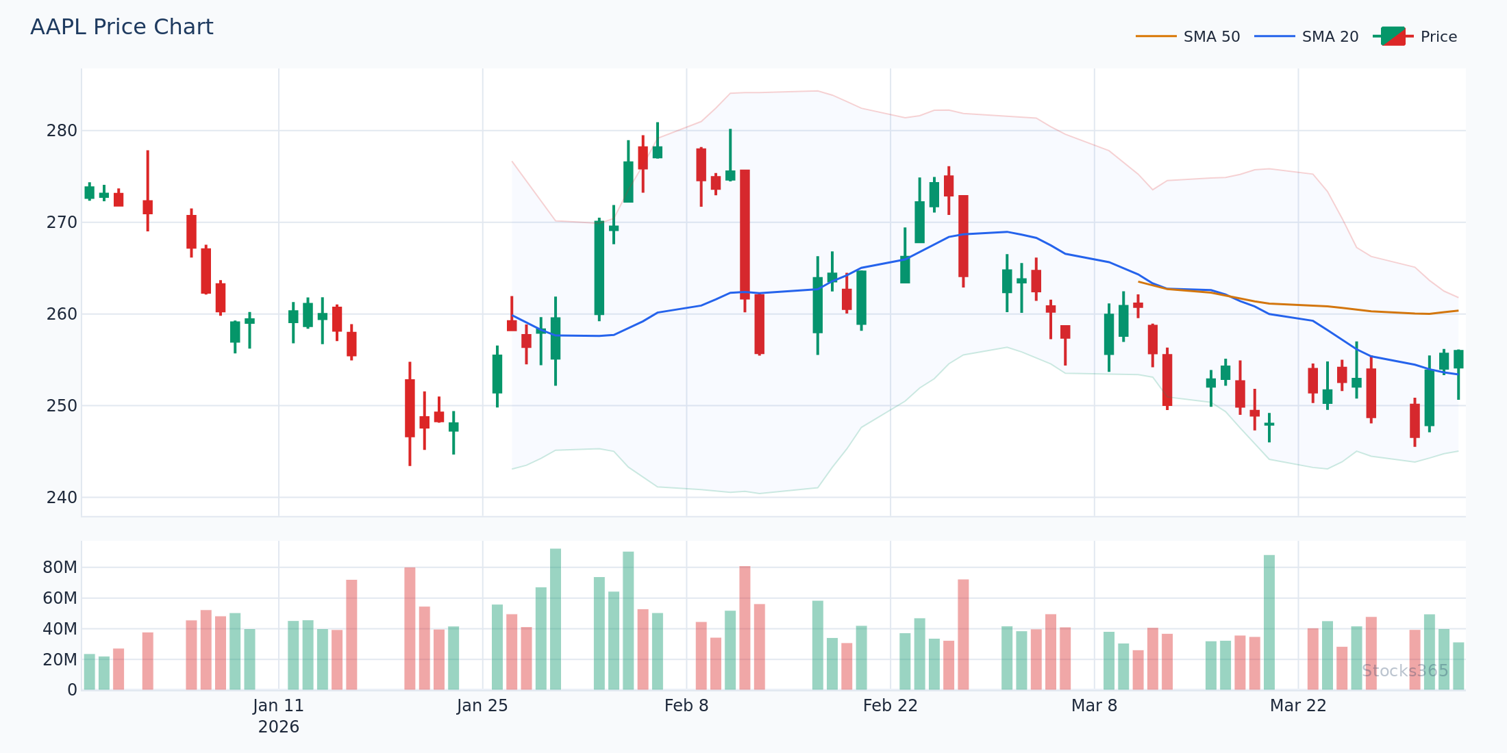
Practical Example: Reading MACD on AAPL in 2026
Let's walk through a complete scenario. Suppose AAPL has been in a corrective pullback, dropping from $198 to $182 over three weeks. The MACD components show the following picture:
- The MACD line is at −2.8, below zero but flattening
- The signal line is at −3.4
- The histogram has been printing shrinking negative bars: −0.9, −0.6, −0.4
This setup tells a compelling story: bearish momentum is clearly fading (shrinking negative bars), and the MACD line is on the verge of crossing above the signal line. A trader might watch for this crossover to confirm, then enter a long position near $183 with a stop-loss below the recent swing low at $180, targeting a return to the $192–$195 range.
The Stocks365 trust score system would factor in this MACD setup alongside volume, broader market conditions, and sector momentum — giving traders a quantified confidence level rather than relying on a single indicator in isolation.
MACD Components Versus Other Momentum Indicators
MACD and RSI: A Powerful Combination
MACD and the Relative Strength Index (RSI) are two of the most complementary indicators in technical analysis. While MACD measures momentum through the relationship between moving averages, RSI measures the speed and magnitude of price changes on a 0–100 scale.
Using both together reduces false signals significantly. If the MACD produces a bullish crossover and RSI is recovering from the oversold zone (below 30), the confluence of signals dramatically increases the probability of a successful trade. If you're new to RSI, the complete beginner's guide to RSI is an excellent starting point for understanding how the two indicators complement each other.
For traders who want to understand exactly how RSI calculates its values — similar to how we've broken down MACD components here — this step-by-step RSI formula breakdown provides the same depth of analysis.
Avoiding Common MACD Mistakes
Even with a thorough understanding of MACD components explained, traders frequently make these errors:
- Trading every crossover: In choppy, sideways markets, MACD generates frequent false crossovers. Always assess the broader trend first.
- Ignoring the histogram: Focusing only on crossovers means missing early warning signals the histogram provides.
- Using MACD in isolation: No single indicator is sufficient. Combine MACD with RSI levels — learn about RSI overbought and oversold levels for powerful confirmation setups.
- Wrong timeframe application: MACD on a 1-minute chart generates noise; it performs best on daily or weekly charts for swing and position traders.
- Misreading zero-line significance: Many traders overlook that the zero line crossing can be as significant as signal line crossovers.
Advanced Applications: MACD with Hidden Divergence
Beyond standard divergence, advanced traders use MACD histogram patterns to spot hidden divergence — a continuation signal rather than a reversal signal. When price makes a higher low but the histogram makes a lower low during a pullback in an uptrend, this hidden bullish divergence suggests the trend is likely to resume. This mirrors concepts discussed in hidden RSI divergence strategies that most retail traders overlook entirely.
Optimizing MACD Settings for Different Trading Styles
Standard vs. Modified MACD Parameters
While the default 12-26-9 settings are universally recognized, different trading styles may benefit from adjustments:
- Day traders (5-min to 15-min charts): Consider 5-13-4 or 8-17-9 for faster signals with less lag
- Swing traders (daily charts): The standard 12-26-9 is well-optimized for this timeframe
- Position traders (weekly charts): 19-39-9 provides smoother signals that filter out weekly noise
The principle mirrors what's discussed in mastering RSI period settings — the right parameter depends on your trading style, not a universal "best" setting. Testing any modifications on historical data before applying them to live trades is essential.
If you're also exploring other momentum oscillators alongside MACD, the comparison of RSI vs. the Stochastic Oscillator shows how different momentum tools measure market dynamics differently — helping you choose the right complement to MACD for your strategy. And for a complete framework on applying momentum signals in live trading, this ultimate RSI trading guide walks through practical setups you can adapt alongside MACD analysis.
Key Takeaways
📊 MACD Components Explained — Summary:
- MACD Line: The difference between the 12-period and 26-period EMA. Measures the direction and strength of momentum. Positive = bullish bias; Negative = bearish bias.
- Signal Line: A 9-period EMA of the MACD line. Crossovers between the MACD line and signal line generate buy/sell signals. Location relative to zero determines signal strength.
- Histogram: The visual gap between the MACD line and signal line. Growing bars confirm momentum; shrinking bars warn of reversals before they occur.
- Best used with confirmation: Combine MACD with RSI, volume, and price structure for high-probability setups rather than relying on MACD alone.
- Divergence is the advanced edge: When price and histogram diverge, a significant reversal or continuation move is often approaching — this is where informed traders position early.
- Settings matter: Default 12-26-9 works well for most swing traders; adjust for day trading or long-term position trading as needed.
Frequently Asked Questions
What are the three components of MACD?
The three MACD components are the MACD line (the difference between the 12-period and 26-period EMA), the signal line (a 9-period EMA of the MACD line), and the histogram (the visual representation of the difference between the MACD line and the signal line). Each component provides distinct information about momentum and potential trend changes.
What does the MACD histogram tell you?
The MACD histogram measures the distance between the MACD line and the signal line. When histogram bars are growing in size, momentum is accelerating in that direction. When bars are shrinking, momentum is fading and a crossover may be approaching. The histogram often provides earlier warning signals than waiting for an actual crossover, making it especially valuable for timing entries and exits.
What is the best MACD signal to trade?
The highest-probability MACD signal is a crossover that aligns with histogram confirmation and occurs after a divergence pattern. For example, a bullish MACD crossover occurring below the zero line, with the histogram transitioning from negative to positive bars after a period of shrinking negative bars, combined with bullish RSI divergence, represents a strong confluence setup. Single crossover signals without confirmation are lower probability, particularly in choppy or sideways markets.
How is the MACD line different from the signal line?
The MACD line is calculated directly from price data (the difference between two EMAs applied to closing prices), making it more reactive and volatile. The signal line is a 9-period EMA of the MACD line itself — this additional smoothing makes it slower and more stable. The interaction between the faster MACD line and the slower signal line creates the crossover signals that traders use to time entries and exits.
Can MACD be used for all asset classes and timeframes?
Yes — MACD works across stocks, ETFs, forex, commodities, and cryptocurrencies, and can be applied to any timeframe from 1-minute intraday charts to monthly charts. However, its reliability tends to increase on higher timeframes (daily, weekly) where signals are less noisy. The standard 12-26-9 settings are optimized for daily charts; day traders often use faster settings like 5-13-4. As with any technical tool, MACD performs best when combined with price action analysis, volume, and complementary indicators rather than used in isolation.